National patient experience survey: Results for patients treated in November 2015
Individual district health board results compared with New Zealand average
Individual DHB survey results are displayed using interactive Tableau charts. If they do not display correctly or you have trouble reading the results, please contact Ying Li. If this is your first time using Tableau, please read the instructions below before proceeding.
Using the interactive charts (below) to read patient experience survey results
- Use the drop-down box on the homepage below to access a list of DHBs.
- Select your DHB, keeping New Zealand as the second option – do not use the drop-down box to compare DHBs.
- Use the tabs along the top to navigate through each domain.
- Return to the homepage to select a different DHB to compare against the New Zealand average.
- Results can be downloaded as a PDF by using the 'download' button on the bottom right of each page.

National survey results
Key findings
- National results for the four domains remained consistent across all six survey rounds.
- There was little variation between DHBs.
- A small increase in response rate was due to an increase in responses to surveys distributed via SMS.
- Weighting has been undertaken, as before, in line with the methodology and procedure documents.
National results
There was very little variation between individual patients in terms of rating their experiences in general, which results in a narrow confidence interval for scores of each domain. Therefore, small changes can be statistically significant. Nationally, scores for four domains showed some significant changes in the second and third survey round, and then remained consistent, see Figure 1.
Figure 1, National average scores for four domains
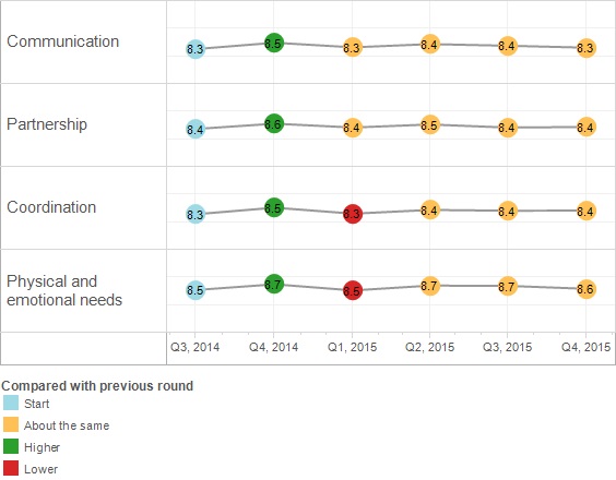
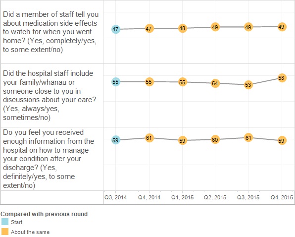
Among four domains, “Physical and emotional needs” has been rated higher than others in all six rounds. It includes the “humanitarian” questions shown in Figure 2, which continuously scored higher than other questions. The three questions in Figure 3 continued to score lower than other questions, indicating potential for improvement.
Figure 2, Percentage in the highest category of these two highest scoring questions
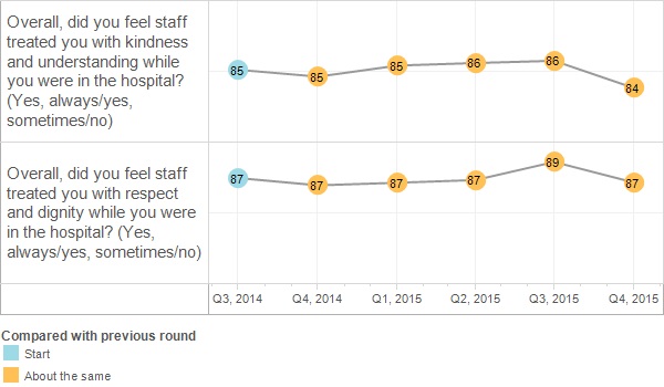
Figure 3, Percentage in the highest category of these three lowest scoring questions
Response rate
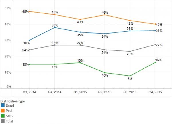
The national response rate increased slightly to 27 percent in November 2015. This was mainly due to the response rate doubling to 16 percent in surveys distributed via SMS. As smartphones are becoming the nation’s most popular device[1], we expect further increases in responses to surveys distributed via SMS.
Compared with the first survey round, the number of patients invited to participate via email increased from 870 to 1660, and the number of responses from this group increased from 260 to 600. Response rates for surveys distributed via post remained the highest among all distribution methods. However, postal surveys have a high processing cost and we encourage DHBs to undertake surveys through email or SMS where possible.
Figure 4, Response rates by survey distribution type
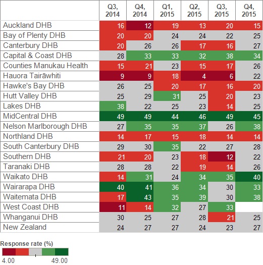
DHB response rates varied. Seven of the 10 DHBs with response rates lower than the national average for the first survey improved their response rates in the sixth survey. In the fifth survey, for the first time, West Coast DHB received enough responses to provide a report. However, due to technical issue, they were unable to provide results in the sixth survey. There were substantial increases in response rate for Hauora Tairāwhiti, but it is still too few responses to present a meaningful result.
Figure 5, Response rate
Representation of respondents
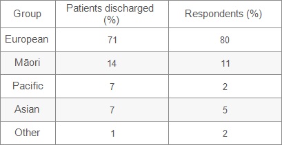
Nationally, respondents were reasonably representative of all ages and gender. However, the low response from people aged 15–24 and 25–44 continued, as did under-representation of people of Māori or Pacific origins.
Figure 6, Respondents by age group
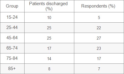
Figure 7, Respondents by gender
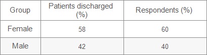
Figure 8, Respondents by ethnicity
References
1. Research New Zealand. 2015. A Report on a Survey of New Zealanders’ Use of Smartphones and other Mobile Communication Devices 2015. URL:http://www.researchnz.com/pdf/Special%20Reports/Research%20New%20Zealand%20Special%20Report%20-%20Use%20of%20Smartphones.pdf