We made this change to fit the current-day context of the reformed health system and align with other health organisations as they respond to changes in work focus and priorities.
Our new te reo name, Te Tāhū Hauora, and updated logo reflect how we see ourselves, our commitment to being a Te Tiriti partnership organisation and the work we do in quality improvement and safety across the health sector. Our English name remains unchanged, but we now put our te reo name first when describing ourselves.
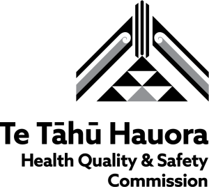
About the tohu and logo
‘Strength comes from the binding of the ridgepole To the ascending and descending rafters To nurture those that live under its presence.’ (Len Hetet)
Whakapapa and explanation of the logo elements
Tāhū – the lines running through the centre represent the three strands that, when woven together, create a strong bind. This represents the three strands that make the Commission: quality, safety and improvement. The tāhu also relates to strength and unity, which gives it integrity. We connect this with our vision: Hauora kounga mō te katoa | Quality health for all
Heke – the heke represent the values, mission and priorities of the Commission, which uphold the tāhū and secure it in place. We connect this with our mission: Whakauru. Whakamōhio. Whakaawe. Whakapai ake. Involve. Inform. Influence. Improve. The two koru represent Te Tiriti enactment through Māori and Crown relations.
Niho taniwha – the niho taniwha pattern represents the village or pā structure, where whānau and hapū live together within a safe environment. This relates to the protection that the tāhū and heke create for the people. People are central to all we do and are represented by the distinct triangle in the centre at the bottom, anchoring the whole structure. The darker triangles in the niho taniwha represent key facets of all Commission work including leadership, relationships, partnerships, facilitation, knowledge and information.
Whakatauakī from artist Len Hetet (who created the tohu):
Pūpūtia te kākaho e kore rawa e whati.
Mā te māramatanga ka pakari te tū.
Mā te hinengaro, mā te tinana me wairua ka pakari hoki te tū.
Waiho mā ngā kaupapa taketake o ō tatou tūpuna tātou e hiki, kia kaha ai tā tātou arataki i runga i te māia, i te ngākau iti me te manaaki tangata.
There is strength in unity.
There is strength in understanding.
There is strength in the mind, body and soul.
Be empowered by the principles of our ancestors to lead with courage, humility and respect.